#include <Button.h>
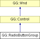
Inheritance diagram for GG::RadioButtonGroup:

Signal Types | |
| typedef boost::signal< void(int)> | ButtonChangedSignalType |
Slot Types | |
| typedef ButtonChangedSignalType::slot_type | ButtonChangedSlotType |
Accessors | |
| ButtonChangedSignalType | ButtonChangedSignal |
| virtual Pt | MinUsableSize () const |
| Orientation | GetOrientation () const |
| int | NumButtons () const |
| int | CheckedButton () const |
| bool | ExpandButtons () const |
| bool | ExpandButtonsProportionally () const |
| bool | RenderOutline () const |
Mutators | |
| static const int | NO_BUTTON |
| virtual void | Render () |
| void | SetCheck (int index) |
| void | DisableButton (int index, bool b=true) |
| void | AddButton (StateButton *bn) |
| void | AddButton (const std::string &text, const boost::shared_ptr< Font > &font, Flags< TextFormat > format, Clr color, Clr text_color=CLR_BLACK, Clr interior=CLR_ZERO, StateButtonStyle style=SBSTYLE_3D_RADIO) |
| void | InsertButton (int index, StateButton *bn) |
| void | InsertButton (int index, const std::string &text, const boost::shared_ptr< Font > &font, Flags< TextFormat > format, Clr color, Clr text_color=CLR_BLACK, Clr interior=CLR_ZERO, StateButtonStyle style=SBSTYLE_3D_RADIO) |
| void | RemoveButton (StateButton *button) |
| void | ExpandButtons (bool expand) |
| void | ExpandButtonsProportionally (bool proportional) |
| void | RenderOutline (bool render_outline) |
| void | RaiseCheckedButton () |
| virtual void | DefineAttributes (WndEditor *editor) |
Structors | |
| RadioButtonGroup (int x, int y, int w, int h, Orientation orientation) | |
Structors | |
| RadioButtonGroup () | |
Accessors | |
| const std::vector< ButtonSlot > & | ButtonSlots () const |
Friends | |
| class | ButtonClickedFunctor |
Classes | |
| struct | ButtonSlot |
| Encapsulates all data pertaining ot a single button in a RadioButtonGroup. More... | |
RadioButtonGroup emits a signal whenever its currently-checked button changes. The signal indicates which button has been pressed, by passing the index of the button; the currently-checked button index is NO_BUTTON when no button is checked. Any StateButton-derived controls can be used in a RadioButtonGroup. However, if you want to automatically serialize a RadioButtonGroup that has custom buttons, you must register the new types. See the boost serialization documentation for details.
Definition at line 227 of file Button.h.
| typedef boost::signal<void (int)> GG::RadioButtonGroup::ButtonChangedSignalType |
| typedef ButtonChangedSignalType::slot_type GG::RadioButtonGroup::ButtonChangedSlotType |
| GG::RadioButtonGroup::RadioButtonGroup | ( | int | x, | |
| int | y, | |||
| int | w, | |||
| int | h, | |||
| Orientation | orientation | |||
| ) |
ctor
| GG::RadioButtonGroup::RadioButtonGroup | ( | ) | [protected] |
default ctor
| virtual Pt GG::RadioButtonGroup::MinUsableSize | ( | ) | const [virtual] |
returns the size of the minimum bounding box that can enclose the Wnd and still show all of its elements, plus enough room for interaction with those elements (if applicable).
For example, a TextControl's MinUsableSize() is just the area of its text, and a Scroll's RenderableMinSize() is the combined sizes of its up-button, down-button, and tab (plus a bit of room in which to drag the tab).
Reimplemented from GG::Wnd.
| Orientation GG::RadioButtonGroup::GetOrientation | ( | ) | const |
Returns the orientation of the buttons in the group.
| int GG::RadioButtonGroup::NumButtons | ( | ) | const |
Returns the number of buttons in this control.
| int GG::RadioButtonGroup::CheckedButton | ( | ) | const |
Returns the index of the currently checked button, or NO_BUTTON if none are checked.
| bool GG::RadioButtonGroup::ExpandButtons | ( | ) | const |
Returns true iff the buttons in the group are to be expanded to fill the group's available space.
If false, this indicates that the buttons are to be spaced out evenly, and that they should all be their MinUsableSize()s.
| bool GG::RadioButtonGroup::ExpandButtonsProportionally | ( | ) | const |
Returns true iff the buttons in the group are to be expanded in proportion to their initial sizes.
If false, this indicates that the buttons are to be expanded evenly. Note that this has no effect if ExpandButtons() is false.
| bool GG::RadioButtonGroup::RenderOutline | ( | ) | const |
Returns true iff this button group will render an outline of itself; this is sometimes useful for debugging purposes.
| virtual void GG::RadioButtonGroup::Render | ( | ) | [virtual] |
draws this Wnd.
Note that Wnds being dragged for a drag-and-drop operation are rendered twice -- once in-place as normal, once in the location of the drag operation, attached to the cursor. Such Wnds may wish to render themselves differently in those two cases. To determine which render is being performed, they can call GUI::GetGUI()->RenderingDragDropWnds().
Implements GG::Control.
| void GG::RadioButtonGroup::SetCheck | ( | int | index | ) |
Checks the index-th button, and unchecks all others.
If there is no index-th button, they are all unchecked, and the currently-checked button index is set to NO_BUTTON.
| void GG::RadioButtonGroup::DisableButton | ( | int | index, | |
| bool | b = true | |||
| ) |
Disables (with b == true) or enables (with b == false) the index-th button, if it exists.
If the button exists, is being disabled, and is the one currently checked, the currently-checked button index is set to NO_BUTTON.
| void GG::RadioButtonGroup::AddButton | ( | StateButton * | bn | ) |
Adds a button to the end of the group.
| void GG::RadioButtonGroup::AddButton | ( | const std::string & | text, | |
| const boost::shared_ptr< Font > & | font, | |||
| Flags< TextFormat > | format, | |||
| Clr | color, | |||
| Clr | text_color = CLR_BLACK, |
|||
| Clr | interior = CLR_ZERO, |
|||
| StateButtonStyle | style = SBSTYLE_3D_RADIO | |||
| ) |
creates a StateButton from the given parameters and adds it to the end of the group.
| void GG::RadioButtonGroup::InsertButton | ( | int | index, | |
| StateButton * | bn | |||
| ) |
Adds a button to the group at position index.
index must be in the range [0, NumButtons()].
| void GG::RadioButtonGroup::InsertButton | ( | int | index, | |
| const std::string & | text, | |||
| const boost::shared_ptr< Font > & | font, | |||
| Flags< TextFormat > | format, | |||
| Clr | color, | |||
| Clr | text_color = CLR_BLACK, |
|||
| Clr | interior = CLR_ZERO, |
|||
| StateButtonStyle | style = SBSTYLE_3D_RADIO | |||
| ) |
Creates a StateButton from the given parameters and adds it to the group at position index.
index must be in the range [0, NumButtons()].
| void GG::RadioButtonGroup::RemoveButton | ( | StateButton * | button | ) |
Removes button from the group.
If button is at index i, and is the currently-checked button, the currently-checked button index is set to NO_BUTTON. If the currently-checked button is after i, the currently-checked button index will be decremented. In either case, a ButtonChangedSignal will be emitted. Note that this causes the layout to relinquish responsibility for wnd's memory management.
| void GG::RadioButtonGroup::ExpandButtons | ( | bool | expand | ) |
Set this to true if the buttons in the group are to be expanded to fill the group's available space.
If set to false, the buttons are to be spaced out evenly, and they will all be at least their MinUsableSize()s.
| void GG::RadioButtonGroup::ExpandButtonsProportionally | ( | bool | proportional | ) |
Set this to true if the buttons in the group are to be expanded in proportion to their initial sizes.
If set to false, this indicates that the buttons are to be expanded evenly. Note that this has no effect if ExpandButtons() is false.
| void GG::RadioButtonGroup::RenderOutline | ( | bool | render_outline | ) |
Set this to true if this button group should render an outline of itself; this is sometimes useful for debugging purposes.
| void GG::RadioButtonGroup::RaiseCheckedButton | ( | ) |
Raises the currently-selected button to the top of the child z-order.
If there is no currently-selected button, no action is taken.
| virtual void GG::RadioButtonGroup::DefineAttributes | ( | WndEditor * | editor | ) | [virtual] |
provides the attributes of this object that are appropriate for a user to edit in a WndEditor; see WndEditor for details.
Reimplemented from GG::Control.
| const std::vector<ButtonSlot>& GG::RadioButtonGroup::ButtonSlots | ( | ) | const [protected] |
returns the state buttons in the group
The button changed signal object for this RadioButtonGroup.
const int GG::RadioButtonGroup::NO_BUTTON [static] |
 1.5.2
1.5.2