#include <Button.h>
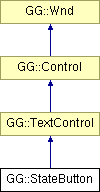
Inheritance diagram for GG::StateButton:

Signal Types | |
| typedef boost::signal< void(bool)> | CheckedSignalType |
Slot Types | |
| typedef CheckedSignalType::slot_type | CheckedSlotType |
Accessors | |
| CheckedSignalType | CheckedSignal |
| virtual Pt | MinUsableSize () const |
| bool | Checked () const |
| Clr | InteriorColor () const |
| StateButtonStyle | Style () const |
Structors | |
| StateButton (int x, int y, int w, int h, const std::string &str, const boost::shared_ptr< Font > &font, Flags< TextFormat > format, Clr color, Clr text_color=CLR_BLACK, Clr interior=CLR_ZERO, StateButtonStyle style=SBSTYLE_3D_XBOX, Flags< WndFlag > flags=CLICKABLE) | |
Mutators | |
| virtual void | Render () |
| virtual void | LClick (const Pt &pt, Flags< ModKey > mod_keys) |
| virtual void | SizeMove (const Pt &ul, const Pt &lr) |
| void | Reset () |
| void | SetCheck (bool b=true) |
| void | SetButtonPosition (const Pt &ul, const Pt &lr) |
| void | SetDefaultButtonPosition () |
| virtual void | SetColor (Clr c) |
| void | SetInteriorColor (Clr c) |
| void | SetStyle (StateButtonStyle bs) |
| virtual void | DefineAttributes (WndEditor *editor) |
Structors | |
| StateButton () | |
Accessors | |
| Pt | ButtonUpperLeft () const |
| Pt | ButtonLowerRight () const |
| Pt | TextUpperLeft () const |
Mutators | |
| void | RepositionButton () |
This class is for checkboxes and radio buttons, etc. The button/checkbox area can be provided via the bn_* contructor parameters, or it can be determined from the text height and format; the button height and width will be the text height, and the the button will be positioned to the left of the text and vertically the same as the text, unless the text is centered, in which case the button and text will be centered, and the button will appear above or below the text. Whenever there is not room to place the button and the text in the proper orientation because the entire control's size is too small, the button and text are positioned in their default spots (button on left, text on right, centered vertically). If no text format flags are provided, the default text orientation is FORMAT_VCENTER | FORMAT_LEFT. Note that the bn_x and bn_y paramters are taken to be relative to the control's x and y position.
Definition at line 144 of file Button.h.
| typedef boost::signal<void (bool)> GG::StateButton::CheckedSignalType |
Emitted when the StateButton is checked or unchecked; the checked/unchecked status is indicated by the bool parameter.
| typedef CheckedSignalType::slot_type GG::StateButton::CheckedSlotType |
| GG::StateButton::StateButton | ( | int | x, | |
| int | y, | |||
| int | w, | |||
| int | h, | |||
| const std::string & | str, | |||
| const boost::shared_ptr< Font > & | font, | |||
| Flags< TextFormat > | format, | |||
| Clr | color, | |||
| Clr | text_color = CLR_BLACK, |
|||
| Clr | interior = CLR_ZERO, |
|||
| StateButtonStyle | style = SBSTYLE_3D_XBOX, |
|||
| Flags< WndFlag > | flags = CLICKABLE | |||
| ) |
Ctor.
| GG::StateButton::StateButton | ( | ) | [protected] |
default ctor
| virtual Pt GG::StateButton::MinUsableSize | ( | ) | const [virtual] |
returns the size of the minimum bounding box that can enclose the Wnd and still show all of its elements, plus enough room for interaction with those elements (if applicable).
For example, a TextControl's MinUsableSize() is just the area of its text, and a Scroll's RenderableMinSize() is the combined sizes of its up-button, down-button, and tab (plus a bit of room in which to drag the tab).
Reimplemented from GG::TextControl.
| bool GG::StateButton::Checked | ( | ) | const |
Returns true if button is checked.
| Clr GG::StateButton::InteriorColor | ( | ) | const |
Returns the interior color of the box, circle, or other enclosing shape.
| StateButtonStyle GG::StateButton::Style | ( | ) | const |
| virtual void GG::StateButton::Render | ( | ) | [virtual] |
draws this Wnd.
Note that Wnds being dragged for a drag-and-drop operation are rendered twice -- once in-place as normal, once in the location of the drag operation, attached to the cursor. Such Wnds may wish to render themselves differently in those two cases. To determine which render is being performed, they can call GUI::GetGUI()->RenderingDragDropWnds().
Reimplemented from GG::TextControl.
respond to release of left mouse button over this Wnd, if it was also originally depressed over this Wnd.
A Wnd will receive an LButtonUp() message whenever a drag that started over its area ends over its area as well.
Reimplemented from GG::Wnd.
resizes and/or moves window to new upper-left and lower right boundaries
Reimplemented from GG::TextControl.
| void GG::StateButton::Reset | ( | ) |
Unchecks button.
| void GG::StateButton::SetCheck | ( | bool | b = true |
) |
(Un)checks button
places the button within the control
| void GG::StateButton::SetDefaultButtonPosition | ( | ) |
Places the button to its default positionwithin the control.
| virtual void GG::StateButton::SetColor | ( | Clr | c | ) | [virtual] |
| void GG::StateButton::SetInteriorColor | ( | Clr | c | ) |
Sets the interior color of the box, circle, or other enclosing shape.
| void GG::StateButton::SetStyle | ( | StateButtonStyle | bs | ) |
| virtual void GG::StateButton::DefineAttributes | ( | WndEditor * | editor | ) | [virtual] |
provides the attributes of this object that are appropriate for a user to edit in a WndEditor; see WndEditor for details.
Reimplemented from GG::TextControl.
| Pt GG::StateButton::ButtonUpperLeft | ( | ) | const [protected] |
Returns the upper-left of the button part of the control.
| Pt GG::StateButton::ButtonLowerRight | ( | ) | const [protected] |
Returns the lower-right of the button part of the control.
| Pt GG::StateButton::TextUpperLeft | ( | ) | const [protected] |
| void GG::StateButton::RepositionButton | ( | ) | [protected] |
Places the button at the appropriate position based on the style flags, without resizing it.
 1.5.2
1.5.2